The Starbucks Logo Evolution: Meaning,Hidden Details, and Visual Identity
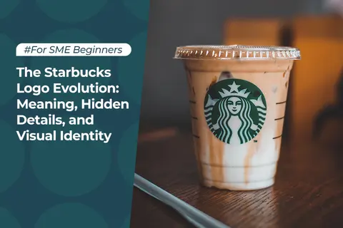
Table of Contents
Starbucks stands as the preeminent coffee house globally, akin to the iconic Apple logo's role for Apple Inc. Indeed, Starbucks owes a significant portion of its success to its branding strategy. The distinctive logo, adorned in hues of green and white, has achieved such widespread recognition that Starbucks deemed it unnecessary to include the company's name alongside it.
But what exactly propelled Starbucks to such heights of success? And what renders the unique twin-tailed siren within its logo so universally iconic? What is the meaning of the Starbucks coffee logo? Delving into the history, significance, evolution, and concealed intricacies of the Starbucks logo, this article aims to unravel the enigma behind why the distinctive twin-tailed siren has emerged as one of the most renowned symbols in contemporary branding.
The History Of The Starbucks Logo
The evolution of the coffee maker's logo is intricately intertwined with its rich history. Founded in 1971 by a trio of friends and coffee enthusiasts, namely Gordon Bowker, Jerry Baldwin, and Zev Siegel, Starbucks initially focused on retailing coffee beans and coffee-making paraphernalia. However, the company underwent significant ownership transitions over the years, which not only reshaped its product offerings but also influenced the design of its logo. Let us delve deeper into this transformative journey.
Anchoring Seattle's Maritime Legacy
Founded in the bustling city of Seattle, Starbucks drew profound inspiration from its maritime heritage when conceptualizing its logo. The original 1971 logo, adorned in monochromatic hues, prominently featured a captivating two-tailed mermaid adorning the walls of Starbucks coffee shops, encircled by the company's name, "Starbucks: Coffee, Tea, Spices."
This maritime motif stemmed from the mythological allure of sirens, mythical creatures believed to entice sailors with their enchanting melodies, leading them to shipwreck off the coast. Leveraging this allegory, the founders sought to evoke the notion that Starbucks seduces coffee aficionados with its irresistible offerings.
From Mermaids to Espresso
In a bid to bolster its marketing endeavors, Starbucks enlisted the expertise of Howard Schultz. Following a transformative trip to Italy, Schultz was captivated by the vibrant coffee culture permeating the country. Proposing the introduction of espresso-based beverages within Starbucks' repertoire, Schultz envisioned an evolution in the company's offerings.
However, met with resistance from the founders, Schultz ultimately departed from Starbucks and embarked on his entrepreneurial journey, founding Il Giornale. This divergence marked a pivotal juncture in Starbucks' trajectory, underscoring the clash of visions and paving the way for Schultz's independent pursuit of his coffee-centric vision.
The Evolution Of The Starbucks Logo
1971
The original Starbucks logo, crafted with inspiration from a wooden carving, depicted a topless siren with a fully visible torso and twin tails. Encased within a circular ring, the logo bore the inscription "Starbucks Coffee, Tea, and Spices," denoting the primary products offered at the company's inaugural coffee shop. Initially adorned in a coffee-brown hue, the logo embodied the rustic charm of its artisanal origins.
1987
With Howard Schultz assuming leadership of the company in 1987, Starbucks underwent a substantial logo redesign. Intending to imbue a sense of freshness, opportunity, and growth, the revamped logo adopted a palette of green, white, and black. This iteration featured a more fluid rendition of the siren, departing from the intricacies of the original design. Accompanied by the streamlined text "Starbucks Coffee," the logo now squarely focused on the company's flagship product.
1992
In 1992, Starbucks undertook another logo overhaul, positioning the siren in a more intimate perspective, eliminating the depiction of its entire body. Despite retaining its signature twin tails, this iteration faced challenges as its simplicity rendered it vulnerable to replication. Unlike most popular dropshipping products, the proliferation of counterfeit Starbucks merchandise posed a significant issue, blurring the distinction between genuine and counterfeit products.
2011
Responding to the fervent feedback from its clientele, Starbucks heeded the call to reinstate its signature branding with a contemporary twist. In 2011, the company unveiled a modern and minimalist logo, eschewing the textual elements, stars, and black background of previous iterations. Leveraging its widespread recognition and brand equity, Starbucks ensured that the logo remained instantly identifiable even in its simplified form. Additionally, the company embraced the digital age by introducing online shopping capabilities, further solidifying its position as best places for online shopping.
The Meaning Behind Starbucks Famous Logo Design
The inception of the original Starbucks logo can be attributed to Terry Heckler, the designer tasked with this endeavor. Drawing inspiration from ancient marine literature, Heckler drew upon a 16th-century Norse woodcut to craft the iconic two-tailed siren emblem. Although initially mistaken for a mermaid, subsequent clarification confirmed its identity as a siren, thus anchoring the logo in a maritime motif that has endured throughout its evolution.
Breaking down the elements of the iconic Starbucks logo, several key components stand out:
1. Shape of Starbucks logo
The Starbucks logo has consistently maintained a circular form, a ubiquitous shape in graphic design symbolizing perpetual motion and enduring legacy. Over the years, iterations of the logo have varied in the inclusion of text and stars, with the latest version opting for a minimalist approach devoid of these elements.
2. Color Starbucks logo
Deep green and white comprise the color palette of the Starbucks logo, symbolizing healing, nature, and prosperity. This color selection reflects the brand's commitment to ethical practices in sourcing coffee beans and fostering positive relationships with farmers, embodying a corporate ethos of social responsibility.
3. Icon of Starbucks logo
Central to the Starbucks logo is the iconic twin-tailed siren, a homage to the company's roots in Seattle and its maritime heritage. While interpretations of the siren's symbolism vary, it evokes notions of obsession, allure, and mystique. In a recent redesign, the siren's facial asymmetry was introduced to humanize her appearance, a departure from traditional notions of beauty that resonated positively with audiences.
In essence, the Starbucks logo encapsulates a rich tapestry of history, mythology, and design principles, embodying the brand's ethos and values while evolving to meet contemporary sensibilities.
Hidden Details Behind The Starbucks Logo
Behind the iconic Starbucks logo lies a trove of hidden details, meticulously crafted to reflect the brand's evolution and values. At its heart is the siren, a symbol of allure and maritime mythology. Initially presented with a facade of perfection and symmetry, the siren's portrayal underwent gradual refinement over the years.
A significant milestone in the logo's evolution occurred during the 2011 revamp, where designers endeavored to enhance the siren's aesthetic appeal. By smoothing out imperfections and ensuring symmetrical features, they sought to imbue the logo with a sense of cleanliness and precision. This meticulous attention to detail aimed to elevate the brand's visual identity and resonate with consumers on a subconscious level.
Despite numerous logo refreshes, designers remained dissatisfied, recognizing the need to inject an element of humanity into the emblematic siren. Thus, in a bold move, they introduced asymmetry to the siren's eyes, subtly altering the shadowing to create a more naturalistic effect. This nuanced adjustment served to humanize the logo, fostering a deeper emotional connection with consumers while preserving its timeless allure.
In essence, the evolution of the Starbucks logo epitomizes the brand's commitment to excellence and innovation. By embracing imperfections and infusing elements of humanity into its design, Starbucks continues to captivate audiences worldwide, transcending mere aesthetics to embody a rich tapestry of history, mythology, and contemporary sensibilities.
Why Does The Starbucks Logo Work?
The enduring appeal of the Starbucks logo lies not merely in its visual aesthetics but in its ability to narrate a compelling story, one that transcends the realms of coffee and commerce. Indeed, effective logo design entails more than a mere depiction of the business's offerings; it serves as a window into the brand's ethos, origins, and aspirations.
At its core, the Starbucks logo embodies a rich tapestry of symbolism and intrigue. The focal point, the twin-tailed siren, serves as a nexus of various narratives, including the inspiration drawn from ancient mythology, the brand's Seattle roots, and the enigmatic allure of the unknown. This multifaceted interpretation sparks curiosity and invites contemplation, fostering a deeper connection between the brand and its audience.
Like many retail pricing strategies,choice of colors in the Starbucks logo further amplifies its distinctive identity. While traditional coffee houses often opt for earthy tones to reflect their products, Starbucks boldly diverges with a palette of green and white. These hues, evocative of nature's verdant landscapes, evoke a sense of tranquility and freshness, setting Starbucks apart from its competitors and instilling a sense of calm in its patrons.
Conclusion
Starbucks owes its enduring success to three pivotal elements: a robust visual identity, a captivating brand narrative, and an unwavering dedication to prioritizing customer satisfaction. And, of course, the cornerstone of it all: a meticulously crafted cup of coffee.
As you embark on your own branding journey, take a page from Starbucks' playbook. Seek inspiration from their example and strive to carve out your own unique identity. Embrace opportunities to set yourself apart from the competition, whether through innovative offerings, exceptional service, or distinctive visual aesthetics.

Start your borderless business here
Tell us about your business and stay connected.


Related Reading

Keep up with the latest from Alibaba.com?
Subscribe to us, get free e-commerce tips, inspiration, and resources delivered directly to your inbox.


